You are using an out of date browser. It may not display this or other websites correctly.
You should upgrade or use an alternative browser.
You should upgrade or use an alternative browser.
Historical price of houses
- Thread starter geordief
- Start date
You might find something here of use.
Thanks.That chart just goes back to 2016,I think.You might find something here of use.
There are yearly(monthly) releases going back to 2020 ,(or even earlier) but I can't find a chart stretching from 2020 to 2200 which is what I am really after.
I can tell you precise prices of 3 bed semis in many areas of Dublin in 1986/87/88- I had a lot of them as advertising clients
Anyone for a 3 bed in Belfield downs @ £32,950? (1986)
But your best bet is probably the archives of the Irish Times and look in the property supplements over a period of years and you will get an idea.
Anyone for a 3 bed in Belfield downs @ £32,950? (1986)
But your best bet is probably the archives of the Irish Times and look in the property supplements over a period of years and you will get an idea.
But for 1986 , would you also need to average industrial wage then, obviously with high unemployment you would also need to know how much the dole was then. Even though nobody on the dole would be buying a house it would give a guide on today's house prices and welfare rates as a comparison.
For example how many weekly dole payments to buy a 1986 house versus the number today to buy todays house, might throw up interesting stuff.
For example how many weekly dole payments to buy a 1986 house versus the number today to buy todays house, might throw up interesting stuff.
Last edited:
Sophrosyne
Registered User
- Messages
- 1,588
Historic prices in real terms would have to take account of, inter alia, inflation.
Generally, house prices follow the ups and downs of the wider economy.
Other factors include the nature and location of the property. For instance, locations might change over time going from bad to good or vice versa.
Average purchaser preferences for house/apartment and/or garden size might also change.
NoRegretsCoyote
Registered User
- Messages
- 5,766
This spreadsheet from the Department of Housing has average house prices for urban areas per annum going back to 1969 until 2016.I wonder if anyone can pointe to a chart where the historical value of an average house over the past generation or so is displayed.
The CSO data which are available from 2005 are much better quality for reasons I won't bore you with, hence the Department of Housing series has been discontinued.
The only continyous, long house price series I know of is from the OECD. I am not sure what it is based on (probably the Department of Housing numbers spliced with CSO) and you can access it most easily here. It's quarterly, as an index (so not in £/€), and is not adjusted for inflation. See chart below.
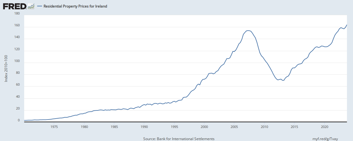
That graph you posted even if it has deficiency and does not adjust for inflation is interesting. The theory that buying property to protect from inflation didn't really reflect in the 1970s and 80s , they rose gradually in the 70s and stagnated in the 80s on average.
The 2 big peaks and trough were in the last 2 decades when we had very low inflation but crucially historically low interest rates.
Therefore property prices are really dependant on interest rates above anything else.. We are now in a rising interest rate environment from a historically low base. As well as that the high tech sector that provides all the high income jobs is retracting that will have a knock on effect throughout the economy. Inflation is really concentrated in the fuel , food and basics sector which will sap even more money out of the economy because you have to buy those goods.
I just don't see much ammunition for house prices to keep going up, the property market has already had its party
Thanks for the replies.It was what I was looking for.Apologies for the confusing "2020 to 2200" in my post(I meant 2000 to 2020)Thanks.That chart just goes back to 2016,I think.
There are yearly(monthly) releases going back to 2020 ,(or even earlier) but I can't find a chart stretching from 2020 to 2200 which is what I am really after.