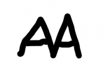
Askaboutmoney Favicon Too Small

trajan

Registered User
Messages
350
Brendan,

The AAM favicon (that little image on the tab of your web pages) is too small to be immediately read.

As such it possesses no cachet of its own - and a nice favicon is a useful thing for a website.

It's easy enough to produce a favicon from a logo or a detail from the logo and then use this website to convert it

https://realfavicongenerator.net/favicon_checker?protocol=http&site=www.askaboutmoney.com

If you can't get anyone to do so for free, I will.
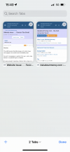
 
I presume that @trajan means the icon to the left of the tab here (this is Chrome - it may appear different in other browsers)?

2023-08-04 15 22 34.png
 
Screenshot from 2023-08-04 17-25-04.png


It's not so much a question of size, but more one of readability and identifiability - the essence of getting the most from branding.

Having a three letter name for an organization makes it hard to optimize the size of a favicon within its allowed space. But the AAM favicon letters are ~ 1/3 of what they could be in the available space. Look at HSE and RTE favicons. Plain as daylight what's on those page just by looking at the tabs.

Some three letter organizations use a non-wordmark logo as their favicon, e.g. NBC, AIB, IBM, PWC and KLM. This of course will take a few hundred to a graphic artist to do decently.

But whatever you choose to do the favicon should be as big as RTE's so it's at least readable, if not readily identifiable.
 
Yes, they are - for most eyes > 50 anyhow !

I'm not suggesting you are competing with AIB or RTE overall.

But as regards being a go-to site for financial advice, and advice on money layout generally, you must be a major presence by now.

And you will get bigger if the favicon seen on favorite sites or bookmarks along the top of our screen is readily visible at least.

And distinctive if possible.
 
So here are a few
1691232211007.png


The BBC's is even less readable than AAM.
The board's one makes no sense but maybe it's just a design and is recognisable.

Instagram's and Wikipedia's are recogisable instantly.

Are you suggesting a symbol/logo rather than the letters?

For example

some combination of the euro symbol and a question mark?

A capital A?
A Capital M?

Brendan
 
Are you suggesting a symbol/logo rather than the letters?

For example

some combination of the euro symbol and a question mark?

A capital A?
A Capital M?

Brendan

I'd be slow to change from AAM... why? Because, that's what the forum/domain/site is called. A €? symbol would be totally unrelated and unrecognisable.

I messed about with the AAM favicon for a bit, and I don't think you'll be able to get 3 capital letters any clearer in such a small image. I even tried white text with the blue background.. that was worse (clarity wise). I even tries various fonts. Still no great results.


aam-favicon.jpg


aam-favicon-blue.jpg
 
I'd be slow to change from AAM... why? Because, that's what the forum/domain/site is called. A €? symbol would be totally unrelated and unrecognisable.

I messed about with the AAM favicon for a bit, and I don't think you'll be able to get 3 capital letters any clearer in such a small image. I even tried white text with the blue background.. that was worse (clarity wise). I even tries various fonts. Still no great results.


View attachment 7721

View attachment 7722
As far as I can see, the smallest versions here are as illegible as the current one.
 
@BB

It's narrower.

Might be more compact still if you shifted one A partly across the other.

Or drop one A over the other like a double chevron.

But this is really a task for a graphic artist.
 
Back
Top